
Ever since the dawn of time, people have been curious about what goes on in other people’s minds. They have been wondering how we can use this knowledge and many great thinkers have devoted their lives to answering this question. Thanks to this curiosity, today there are many aspects of psychology, behavioral economics and other sciences that can help us understand our users better and improve our experiences by using such knowledge.
UX laws are a nice way to approach some general ideas about how people think and feel about digital experiences since the user experience encompasses more than just aesthetic design, color schemes and page flow. It’s all about reaching out to the customers and understanding them. The understanding we are seeking for is a deep and inclusive understanding which covers psychology and other behavioral motivations.
The psychology behind customers’ expectations is the subject of UX laws. As a result, anyone who wants to build winning designs should follow them, even if they don’t know what the idea is based on. It’s pretentious but not wrong to say; every successful product is based on fundamental principles in psychology and UX laws. When you take the principles of psychology into account, you’re able to build products and experiences that are more intuitive, more user-friendly, and simply better designed.
In this part of the article, we will explain the first 10 UX laws by beginning with human-computer interaction. We will try to reach an understanding of users’ behaviors and some outputs with the help of psychology and behavioral sciences this time.
Then, in our next blog, we will discuss the other 10 UX laws in relation to user-centricity in design. Follow us on social to be the first ones to know 👉
Human-Computer Interaction
The field of human-computer interaction is concerned with the design of user experience. With a more human-centered focus and an increased understanding, this field is crucial to building products that convert.
Human-computer interaction is not a new science but it has recently gained attention as its own field. As early as the 1950s, computer scientists were aware of the need for user-friendly designs in order to effectively reach a mass audience.
The 1970s marked a turning point for human-computer interaction when computer scientists began to take a more empirical approach. The first human interactions with computers were described as human factors or software psychology. Then by 1979, the term human-computer interaction had been invented.
While there were some attempts to make computers more accessible during this time including graphical interfaces, mouse input devices, and hypertext it wasn’t until the 1980s that human-computer interaction really took off. Apple’s Macintosh computer was one of the first commercially successful personal computers to feature a graphical interface and mouse input device, ushering in an era where software was expected to be intuitive and easy to use.
The goal of the human-computer interaction field is to make sure that, when people use technology, they are able to complete their goals in a way that feels natural, efficient, and satisfying. For example, a big part of human-computer interaction research focuses on improving the usability of websites and apps so we don’t waste time scrolling through menus looking for what we need or getting frustrated by confusing interface designs.
Human-computer interaction is basically the study of how people use computers and technology. It covers everything from what font you should use when you’re writing an email to how many clicks it takes to get from your homepage to the product page on your e-commerce site. In short, it’s all about user experience design and it makes a difference in every aspect of our daily lives; from what type of keyboard gets installed on your new laptop to how much time you spend scrolling through Instagram.
It’s based on a thorough understanding of user psychology and behavior. This knowledge allows product designers to create highly persuasive products. The human mind makes decisions through a process called cognition. Through our research and analysis, we’ve created an easy-to-follow process to help you develop new, exciting products your customers have been waiting for.
Laws Of UX
Jakob’s Law

“Users prefer your site to work the same way as all the other sites they already know.”
Here is a brief video about it.
According to Jakob’s Law, people are looking for similarities. Have you ever heard someone say that they’re having trouble learning a new app because it doesn’t work like their old, familiar app did? That’s simply the explanation of Jakob’s Law. People don’t enjoy being confused by new things, they want experiences that feel familiar. When a user has come to expect that something will work a certain way, it can be very disorienting for them when it doesn’t. There is an ongoing debate on it, how users’ love for their habits kill the creativity of design.
For example, if there are multiple sites in your industry that use navigation bars located at the top of the page, then you should probably be using a navigation bar located at the top of your page as well. If most sites have a search bar near their navigation bar, then you should make sure yours is close by too. If most sites have a sidebar on their home page with lists of recent posts or suggested related content, then adding a sidebar might be helpful for users as well.
Aesthetic-Usability Effect
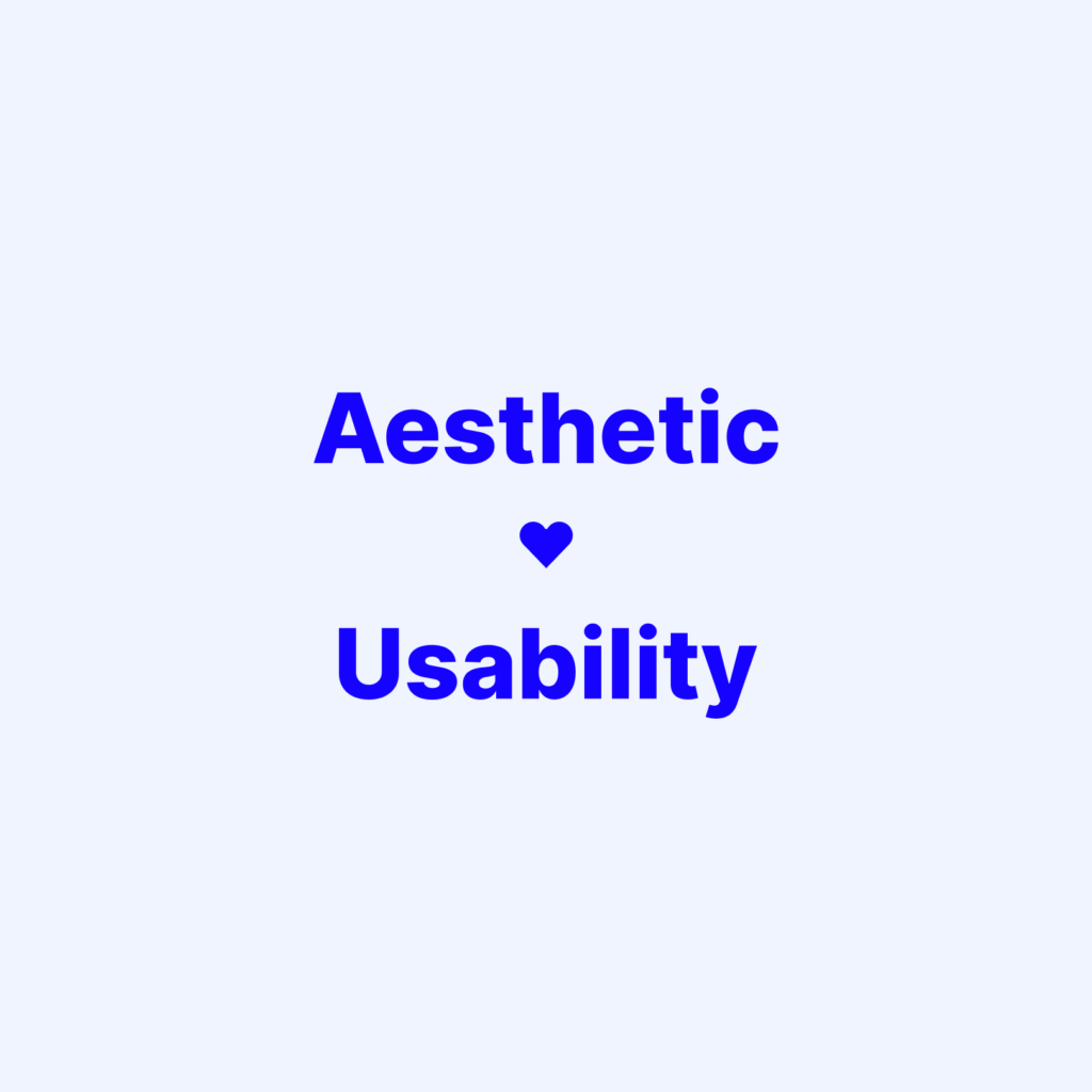
“Users often perceive aesthetically pleasing design as design that’s more usable.”
It is a common misconception that aesthetic design and usability are opposites of one another. In fact, a product’s aesthetic design often has a direct effect on its perceived usability. As the law states, users are highly likely to judge a web page or app based on its aesthetic appeal.
To see evidence of this, look no further than your own experience using the internet. What types of websites have you found yourself returning to again and again? Have they been plain text pages with no images or color? Or have they been dynamic, colorful pages that have a pleasing visual appeal? It’s unlikely that you’ve returned to the same text-only page more than once. The reason for this is simple: we prefer aesthetically pleasing designs because they make us feel at ease and happy while we’re using them, which motivates us to come back for more.

Doherty Threshold
“Productivity soars when a computer and its users interact at a pace (<400ms) that ensures that neither has to wait on the other.”
The human-computer relationship is a quick one and it’s growing quicker every day. People expect computers to respond to their requests faster than they can even ask for them and they expect the computer to be right on time. Computers are capable of processing information much more quickly than humans can. People need a certain amount of time to gather information and make decisions, but when they give this input to computers, they expect computers to be able to run with it right away. When this doesn’t happen, people get frustrated and begin trying to take back control over the process.
When the time between a user’s action and feedback from their computer is less than 400 milliseconds, productivity soars. This is because both humans and the computers can work at a pace that matches up with their capabilities, without having to wait for either one of them to catch up.
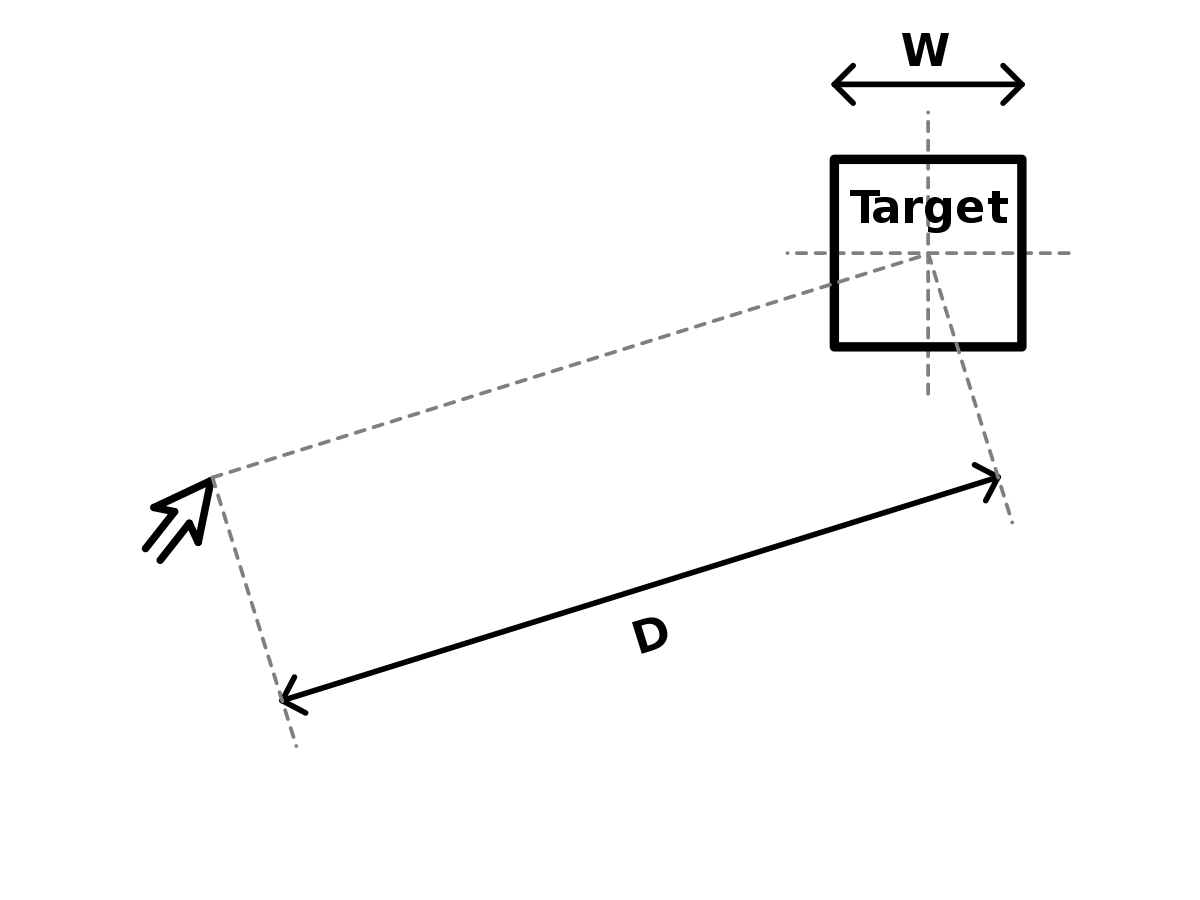
Fitts’s Law
“The time to acquire a target is a function of the distance to and size of the target.”
The time it takes to acquire a target increases as the distance to and size of the target increases. This is known as Fitts’ law, named after psychologist Paul Fitts, who studied the human motor system in 1954. Fitts discovered that the time to move towards a destination is directly proportional to its distance and inversely proportional to its size. This means that as distance increases, speed decreases, and vice versa. He also found that faster motions and smaller targets lead to higher error rates due to the speed-accuracy trade-off.
Hick’s Law
“The time it takes to make a decision increases with the number and complexity of choices.”
That’s what Hick’s Law tells us about how humans respond to stimuli. And when we look at two psychologists’ research from 1952, we can see that William Edmund Hick and Ray Hyman were definitely onto something. In their experiment, they found that the more stimuli present in a situation, the longer it takes an individual to react to any given stimulus. That means when we have too many options, we have more work to do before we can even begin to interact with what is presented.
Research has shown that the more options there are, the harder it is to make a decision. This happens because each choice must be compared against the others, and this comparison process is time-consuming. The time it takes to make decisions increases as the number of choices increases. In addition, having too many choices can lead to regret about the option selected, which often results in choosing not to choose at all. The best way to avoid analysis paralysis is to limit possibilities.
Miller’s Law

“The average person can only keep 7 (plus or minus 2) items in their working memory.”
Our immediate memory and ability to make absolute judgments are both restricted to roughly 7 pieces of information, according to George Miller’s 1956 study “The Magical Number Seven, Plus or Minus Two: Some Limits on Our Capacity for Processing Information.
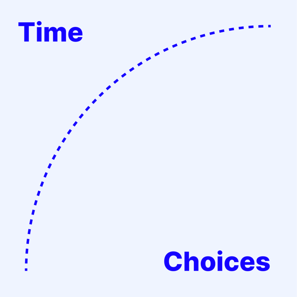
Goal-gradient Effect
“The closer users are to a goal, the faster they are going to work to complete it.”
Your UX is designed to make a user reach their goals faster, remove any friction that may be in their way, and build a positive brand image. The closer users are to a goal, the faster they are going to work to complete it. This means that if the goal is right in front of them on the page, they will take action faster than if they had to search for it.
That occurs when a person who has almost finished achieving a goal works harder to reach that goal and will try to achieve this goal in the fastest possible time. When users are provided with feedback about their progress, they may become more motivated to finish the job. For example, if you have three more screens left and only fifty percent of the calls to action on all three screens have been clicked, you may be more motivated to click the rest of the call-to-action buttons.
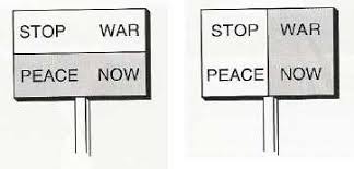
Law of Common Region
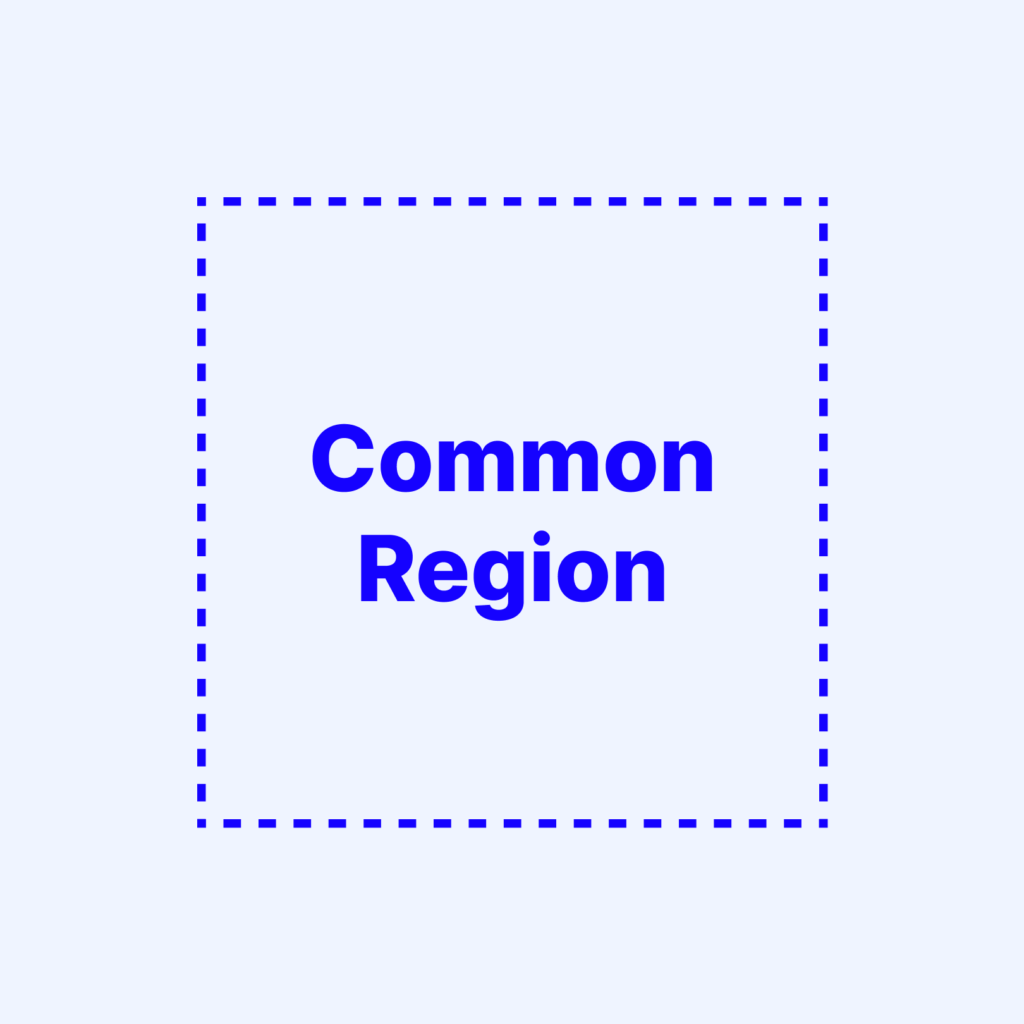
“Users group together elements that share an area with a defined boundary.”
Have you ever seen a user interface where the background, foreground, and border were all the same color? If yes, you probably felt like that was very weird. That’s because we perceive elements as part of a segment or region based on their current context. What we see influences what we know and what we can do. This is the ‘Law of Common Region’ in action.
One of the most common interface elements that is put on webpages is horizontal lines separating page elements from each other. It’s no surprise why designers use these line separators: they simply help website users to know when one section ends and the next one begins. These lines make it easier for users to scan each page element separately and comprehend information more quickly.
Law of Proximity

“Users tend to perceive similar elements in a design as a whole even if the elements are separated.”
The similarity is a way to establish relationships between your design elements. These relationships inform the user that certain elements have something in common and can logically be grouped together. This makes them more meaningful and increases their perceived importance.
Law of Uniform Connectedness
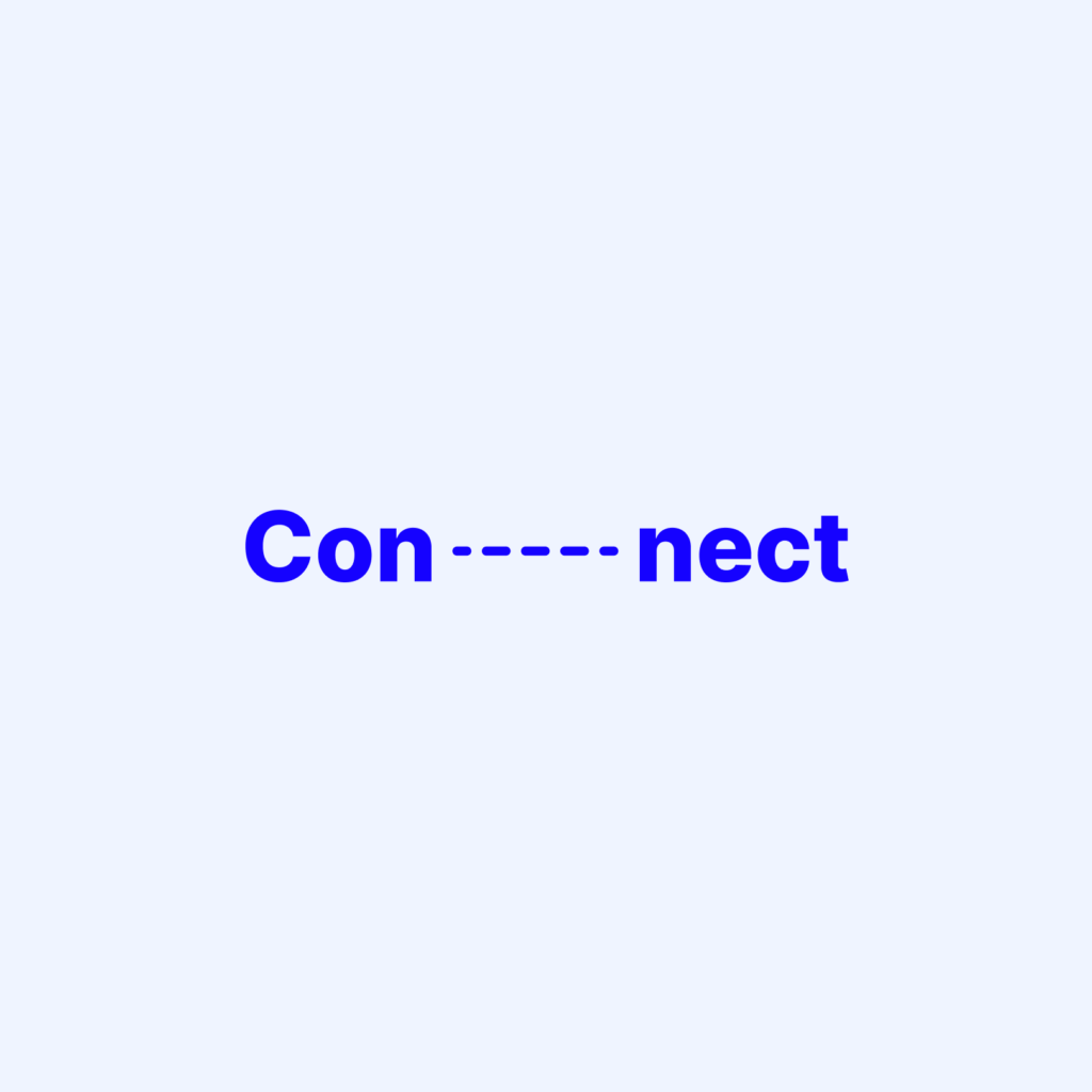
“Visually connected elements are perceived as more related than elements with no connection.”
The Law of Uniform Connectedness is a principle that leverages our inherent psychology to create visually-driven connections between elements. Why is this important? Because research indicates that these connections make us perceive things as more related than they might actually be.
Also known as Gestalt Factor, the law was formulated by Gestalt psychologists in 1910. The law essentially uses our tendency to perceive elements as cohesive based on the proximity and relationship between two objects. In other words, our brains are hardwired to see connections between things even if they really don’t exist. So, with this method, if you want to connect two or more elements visually, place them close together with alternative treatments, thereby creating the appearance that they are connected, as opposed to trying to make them appear that way with color, shapes, or any other design elements. The effect can be dramatic when used properly and just enough contrast exists between the elements involved in connecting.
To sum up,
Knowing these principles, you can develop and market good products. In product design and development, most companies want to build products that are validated by a target audience using user-centered design methodologies. However, they are not only for designers. At its core, the principles of UX are built on the psychology of persuading people to act. And they are for everyone who persuades people.

