
The world wide web is full of landing pages. We are having interactions with landing pages all the time without even noticing. We’re visiting them through e-mails, stories, posts, e-books, and videos. It is simply because they are one of the simplest ways to drastically boost ROI, let visitors know about your product or service, persuade them to do something, or leave their contact information.
Building a high-converting landing page requires putting together a set of well-performed practices such as user experience, conversion rate optimization, behavioral economics, development, and so on. In this article, we will first go over the concept, followed by an actionable approach to creating landing pages with real-world examples.
What is a Landing Page?
Landing pages are web pages or screens that are designed with a particular purpose to lead users into something without distractions. Generally, they contain a type of form asking for action for lead generation, registry or purchase purposes and have a pixel to gather visitor information for further retargeting campaigns.
As we mentioned before in another article on the tio blog, landing pages are the web pages where users “land” or arrive at a bigger website, mobile app, web platform, etc. They also can be seen as the first touch points of digital products.
Most of the time, landing pages are in the middle of a digital marketing funnel. The SERP, newsletter, social media post, search ad, social media ad, another website, or any other source may lead users to a landing page trough the CTA (call to action). Then, a well-designed landing page convinces them to behave in a specific way, such as leaving their email addresses.
A landing page isn’t equal to a homepage and we recommend it shouldn’t be since landing pages focus more on conversion rate than any other pages of a website when designed in the right way. However, there is a tendency to use them as a substitute for each other. Although it’s not ideal it’s okay too if you at least design your homepage with the landing page best practices and embed a form.
Although landing pages would be used in a variety of ways, they all have some common characteristics such as being created to lead visitors to take a specific action. A landing page would work for different sales funnel stages. It can be the homepage of your taxonomy or it can be a completely new page created for a specific purpose.
The important point is to remember that landing pages are intended to generate specific conversions. The ultimate goal is always to lead users to an action. The action would vary according to the business and marketing goals. It may be signing up for a SaaS product or any other service, booking, purchasing, leaving contact information, downloading an e-book, etc.
Why Do Well Designed Landing Pages Matter?
Since converting visitors into leads is the first step in developing a relationship between your business and potential customers, landing pages have a critical function. You can catch your visitor’s complete attention by removing navigation, competing links, and alternate options from your landing page. And having full attention means you can direct your visitor to the desired destination, which would be your lead generation action.
Landing pages are designed with a single aim in mind: conversion. As a result, they offer some information and then simply make a call to action (CTA). In this manner, it’s very clear for the visitor what to do next. So the goal is conversion, what a good conversion rate would be? According to this study, the average conversion rate for landing pages among industries is 2.35%, with the top 25% converting at 5.31% or higher. When you focus on the top 10% of landing pages, you will see conversion rates are around 11.45% or higher.
A dedicated landing page is also a traffic destination, and when a well-structured experience promotes a single offer, visitors are more likely to become customers.
They are focused on one goal or call to action by offering information about a certain offer or item, landing pages convert more traffic. It has little navigation, which keeps visitors focused on the goal rather than getting distracted by various links that take them away from the website.
To summarize, landing pages are specifically designed to generate conversions, as a part of your CRO. Increased conversion rates imply more purchases, sign-ups, free trials, and so on.
How to Create High-Converting Landing Pages?
Of course, there is no one size fits all solution for high-converting landing pages but there are best practices created by years of hands-on experience. We created the list below based on our lean digital product development experience in tio, but they are beneficial for any landing page no matter niche or desired conversion.
No matter how exceptional your landing page is, there will be several drop-offs and bounces. 90% of drop-offs are accepted as successful across all industries. However, there is no guarantee that your landing page will be one of the most successful landing pages and convince %10 of visitors.
A well designed landing page is one of the easiest ways to control the message you are giving. Because of this, it’s important to make sure yours stands out from the crowd. Unfortunately, there is no certain formula to build a perfect landing page at once. However, a data-driven approach that puts validation in front of anything will lead you to develop one eventually. Building your landing page based on best practices from the beginning will decrease the required steps you need to take for a flawless landing experience. After applying these, you could still run several experiments for improvements, especially AB tests and multivariate tests. Then according to the test results, you would need to optimize your landing page to achieve maximum conversions.
With all of these details in mind, we will provide you with an actionable guide to start with. Here are seven steps to build a high-converting landing page:
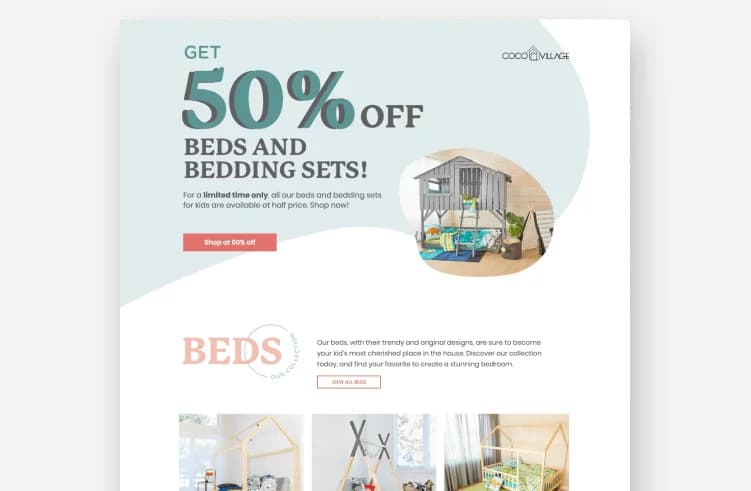
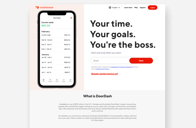
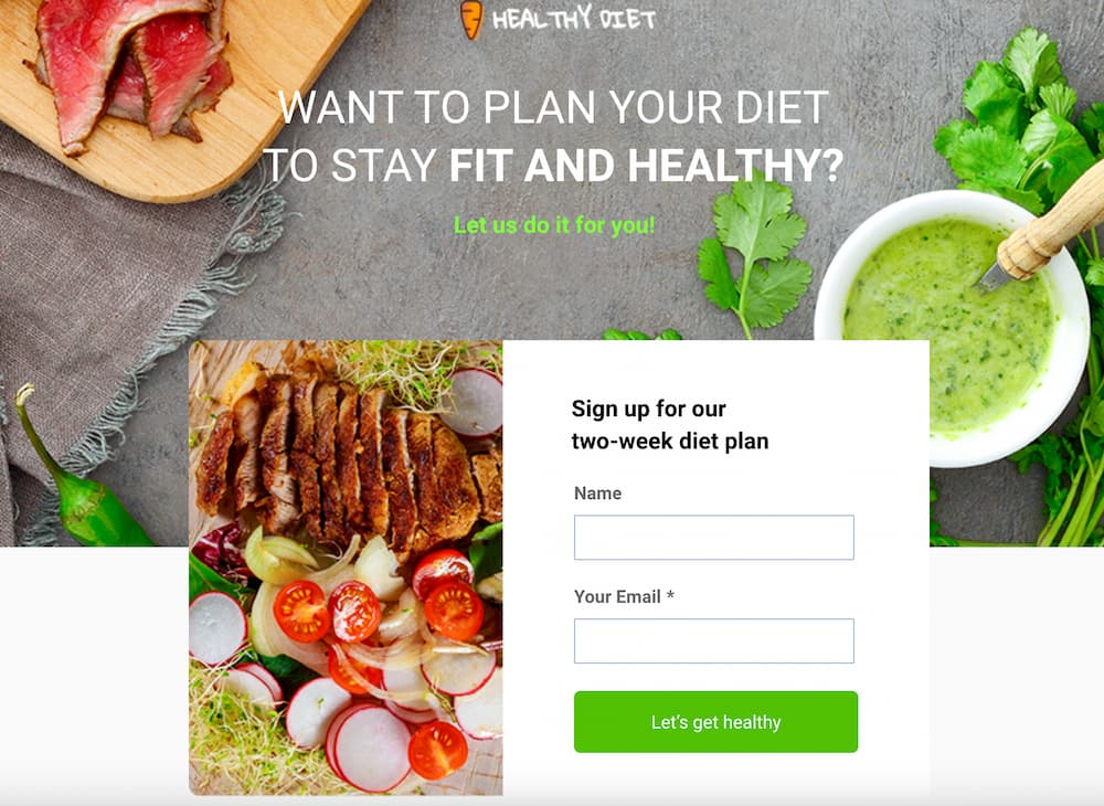
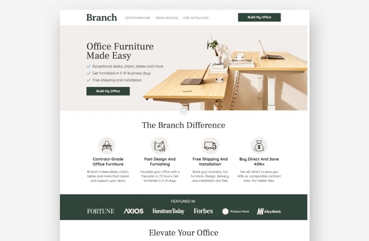
1. Make your hero statement stand out.
2. Use explanatory and convincing subheadlines.
3. Have a clear call to action.
4. Why?: Give them a reason.
5. Remind them the pain points.
6. Explain the solution.
7. Always add social proof.
We explain each of these 7 steps below with some examples of great landing pages.
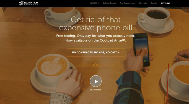
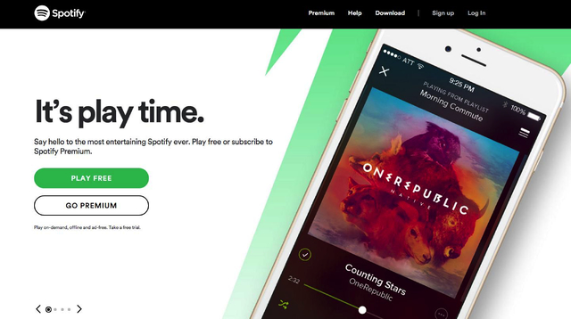
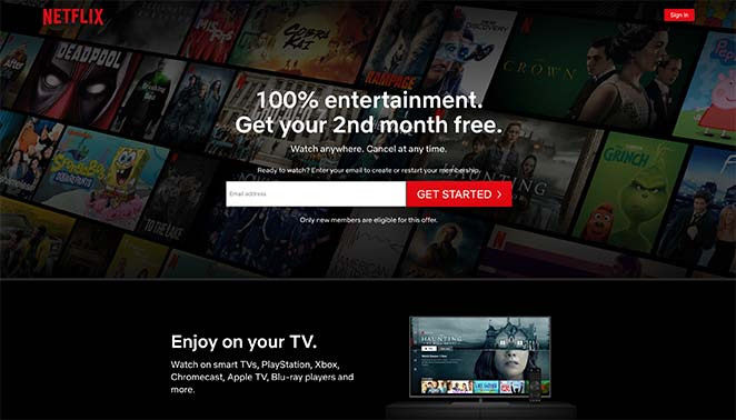
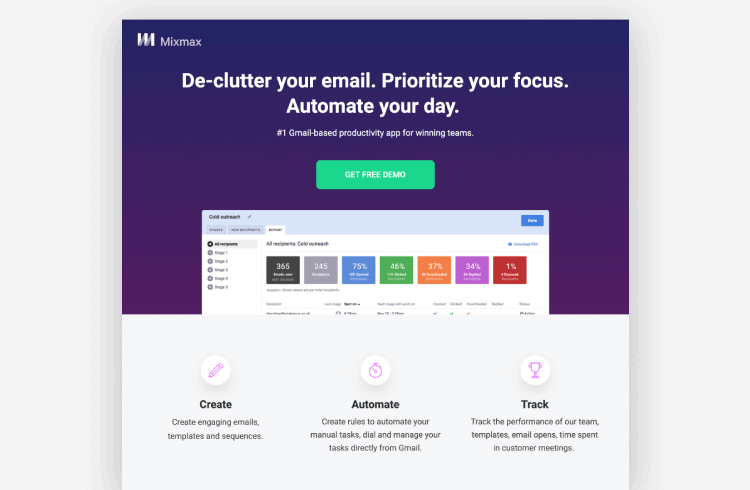
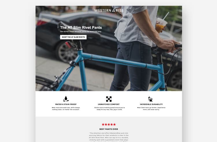
1. Make Your Hero Statement Stand Out
As we mentioned above, landing pages are generally in the middle of a marketing or sales funnel. It means people who visit a landing page have already been interested in the offer. (If you didn’t get their attention with a clickbait CTA which has no point other than manipulating performance reports and blurring your precious analytics data.)
After they clicked or tapped a CTA and landed on your landing page, the first thing you should do is keep your visitor’s attention. It means the hero statement, the first lines visible on the page, is the first section you need to optimize. When properly created, a hero statement can capture visitors’ attention and persuade them to explore more.

The one or two sentence statement that appears at the top of your landing page is known as a hero statement. When it’s written well, a hero statement can introduce the product or services, the company, its vision, and most importantly its value proposition.
2. Have Explanatory and Convincing Subheadlines
Landing pages should simply and swiftly explain the value of an offer. What you ask from the visitors should be crystal clear in order to convince them to take the expected action. You should provide a well-structured information architecture to be understandable. Subheadlines are great positions to give extra explanations to support your hero headlines.
Explosive subheadlines should draw your visitor into the content, making them be curious about whatever you’re presenting.
3. Have a Clear Call to Action
The purpose of your landing page is to convert visitors into customers. That’s why your landing page needs a clear call to action (CTA) which is a short statement that directs visitors to execute the desired actions. A CTA should be clear, concise and immediately perceivable by visitors. It should also explain the action that you want them to take after completing their journey on your website.
Your CTA is the conversion point, with one action-oriented button. A poorly designed CTA can do more harm than good, and your visitors will no longer trust you as a trustworthy source of information. You have to have a clear CTA that commands your visitors’ attention and directs them to take the desired action within your landing page such as “Submit”, “Buy Now” or “Book a Spot”.
- Keep it brief, no more than four words.
- Use action verbs such as ‘Get’ and ‘Subscribe.’
- Incorporate a subtly persuasive and urgent tone.
- Use terminology that is consistent with your brand’s identity.
- Try to be as direct as possible. After clicking on your CTA, visitors should know exactly what to expect.
4. Why?: Give Them a Reason
As we mentioned before, the goal of a landing page is to provide visitors with a clear understanding of your offer. While potential customers are on your site and reading about the value you can bring them you should explain the benefits of choosing your solution over other solutions.
A well-structured landing page provides visitors with a clear “why”. It should be an answer to the question, “What do you want me to do next and why would I do it?”. If you want people to take action on your landing page, it’s important that your visitors get a clear answer to the question at a glance.
5. Remind the Pain Points
Since the landing page is probably where you met with a user, it’s natural if they have doubts and second thoughts. Reminding their pain points and explaining how your product or service might be helpful to clear the air. Pain points are distinct problems that your potential users/customers might be having and they are usually the reason for their landing page visits.
The landing page should explain, in clear language, what your company does and how it helps the visitor solve their pain points. It’s important to convince visitors that your product solves their problem as quickly and efficiently as possible, so they’ll have no choice but to buy right away.
By addressing these issues, you can make the user experience more seamless and improve your chances of completing the conversion. You can read a more detailed article on pain points here.
6. Explain the Solution
No matter what your specific goal is, your landing pages should always include how you remove the pain points and capture your visitors’ attention in a very efficient manner. To accomplish this, the landing page should explain what you offer and how it could help them with the pain points they are experiencing. It should also explain why they should choose to use your product.
7. Always Add Social Proof
Last but not least, social proof is also important to increase the conversion rate on landing pages. There are several academic research proving that people trust reviews and recommendations. Because social proof helps you to build trust, they play an important role in increasing the likelihood of a user following through with an action or taking the next step on your sales funnel.
A social proof element in a landing page usually takes the form of text or images that show people who have been persuaded to use the solution before.
Conclusion
A landing page is a website that visitors hit after clicking on an advertisement, or another outbound link. There’s no doubt that landing pages are incredibly useful to boost your ROI, promote your products or services, persuade visitors to take action, or collect contact information. It seems like a very simple concept, but getting visitors to sign up for your service, or buy your product is often challenging. That’s why we wrote the 7 steps. By following these steps, you can build a landing page that really packs a punch.


