212 Magazine
212 Magazine is an international art and culture magazine based in İstanbul.
Company Size
1-20 employees
Industry
Art & Culture
Our Services
Content Management System
E-Commerce
Backend Development
Frontend Development
API
Client
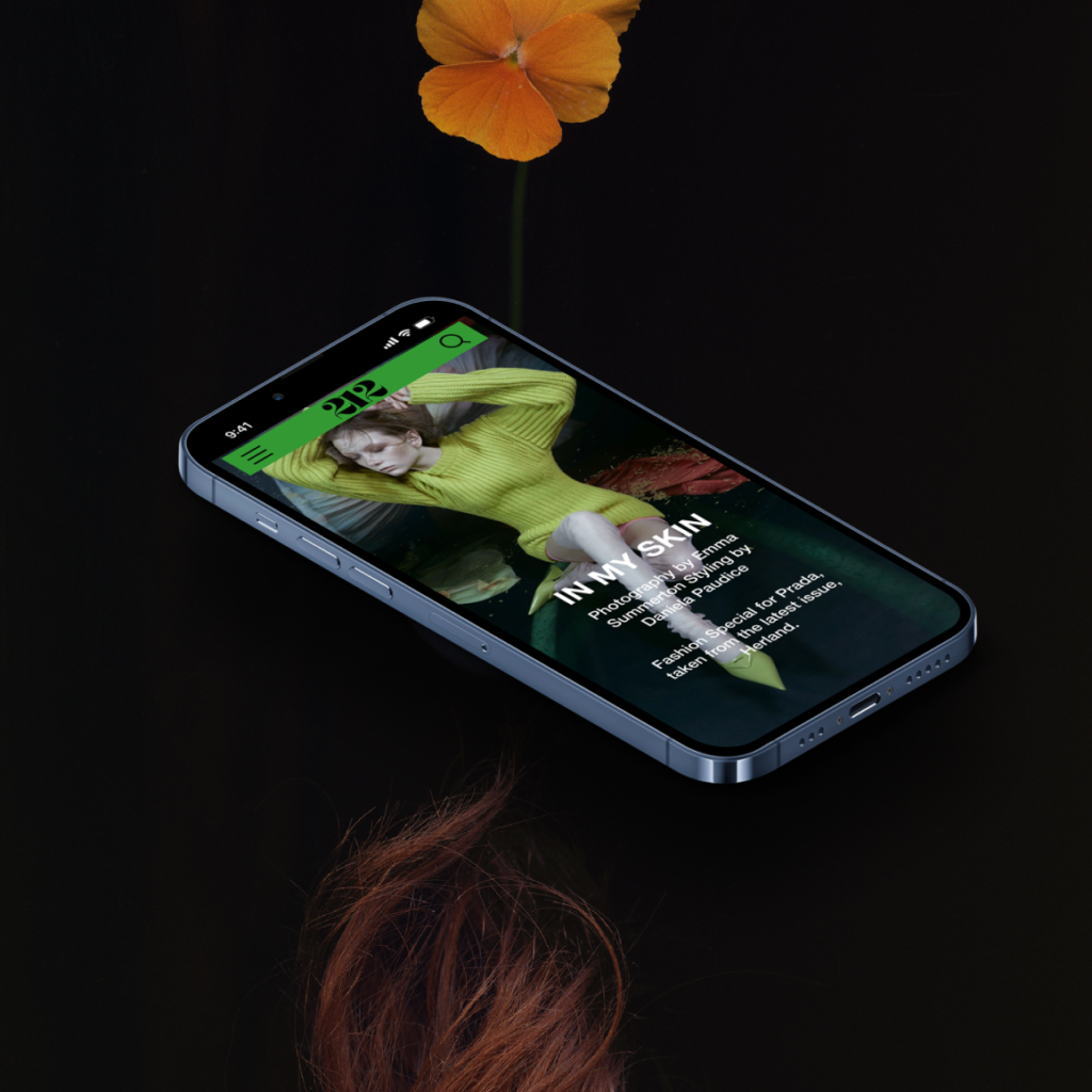
212 Magazine is an international biannual arts and culture magazine produced by 212 Studio in both English and Turkish. The magazine wants their readers to have a real joy of experiencing a magazine while they slow down, take a break and have a cup of coffee. They reached us to create a digital version of their printed magazine with the same “slow” reading experience.
Challenge
Our main mission was to transfer 212 Magazine’s reading experience to digital. 212 Magazine is not a magazine to be consumed quickly by turning pages and just looking at photos. So the website shouldn’t be only for scrolling. The flow of the reading experience had to be controlled by the readers. The static structure of the magazin will be preserved for digital issues too.
Behind the scenes, the editors should be able to update the website for new digital issues.Although 212 Magazine is a visual-heavy magazine, they use a variety of different artistic mediums.
To maintain creative freedom, editors should be able to publish contents with different formats including photos, videos, texts, and audios. Meanwhile their visual identity should continue on the web. The design was created by Studio Pul and it was thankfully far from a mainstream theme. So our part was to create a flexible CMS displayed by a responsive frontend to make it easy for editors to recreate a fine designed website for every content they want to create.
The website also has an e-commerce section for current issues, old issues and merch items. In stark contrast to an average ecommerce website’s user experience, 212 Magazine has a completely different consumption nature. We should have created a universe which includes a high converting online shop and an artistic channel together.

Solutions
We partnered with Studio Pul to work on this new digital experience for 212 Magazine. The design system was created by Studio Pul. We started with a series of meetings since we prioritise providing constant feedback from all stakeholders as we progress.
As their tech-partner, we built the digital version of the magazine with Gatsby and Strapi. This duo allows us to be truly independent on frontend. So the editors can create digital issues with a beautiful dynamic interface designed by Studio Pul that follows the same experience of printed 212 Magazine. They can enter contents to the website without technical background or coding. They can use different mediums for content by keeping artistic flexibility whilst sustaining overall visual identity. The website also has an online shop for current issues, back issues, and other merch items.
Keeping the website up to date, shouldn’t require technical intervention for every new issue. They needed a CMS solution with a custom frontend. That’s why we decided to use Strapi for the cms panel and Gatsby JS for front end development. In most CMS, every component should be determined in advance, yet we were able to create a customizable content entrance flow. The design was broken into reproducible components and CMS logic was built accordingly to make it possible for editors to follow the design guidelines without writing any code. Editors are able to easily choose between design decisions; from background colours to direction of visuals. Meanwhile, this structure restricts data entry enough, causing a result contradictory to 212 Magazine’s visual identity would be quite impossible.
To present the feeling of reading a large-format art magazine slowly, we avoided using quick animations, auto transitions. Every section of a certain page can be relocated dynamically like a lego piece, but as a whole the website has the same immersive feeling regardless of changes. For the e-commerce part of the project, we use Shopify with a custom theme.

Results
As 212 Magazine’s tech partner, we carried the spirit of reading a published large format magazine to digital with their website. The result is a very unique website that reflects the printed publications feeling.
Strapi is used for building a headless content management system since the project requires dynamic content entriness by non-technical people. The website puts forward visual communication and photography, but also has fictions as text, interviews as videos, etc. The CMS panel allows them to maintain the experience.
Using Shopify’s infrastructure, we constructed the merchandising component of the project. We adapt a Shopify theme to integrate an online store with the sense of an art magazine.
We’re looking forward to experience next issues.
 Tio x komün* Case Study | Building a Mobile App and a Website for a Scale-Up
 Tio X 240 Derece Case Study | Building An Order Management System For An Online Bakery